Visual Identity for Cosmoscow International Art Fair
Visual Identity for Cosmoscow International Art Fair
The Cosmoscow International Contemporary Art Fair is an annual landmark event of the Russian fall art season. The main goal of the project is to develop the Russian art market, integrate Russian artists into the international context, and create a platform for interaction between collectors, gallery owners, businessmen, journalists, and the art community.
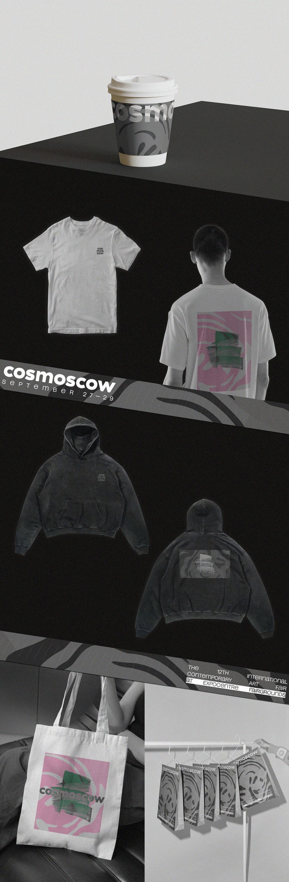
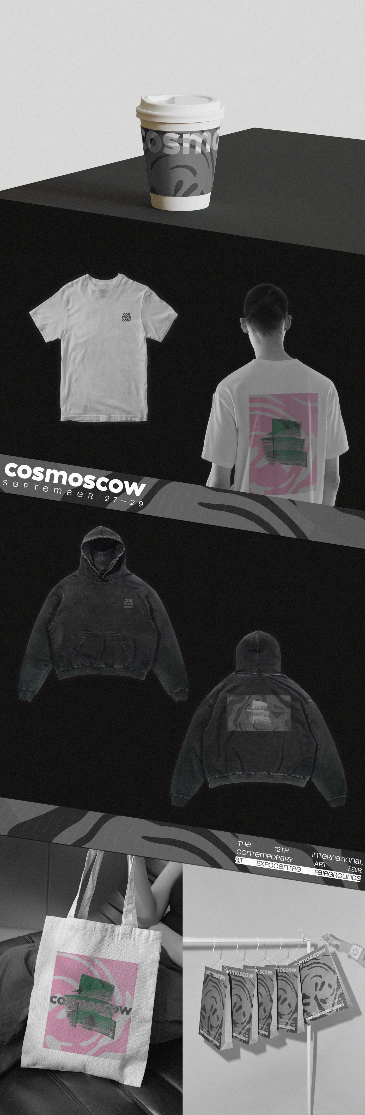
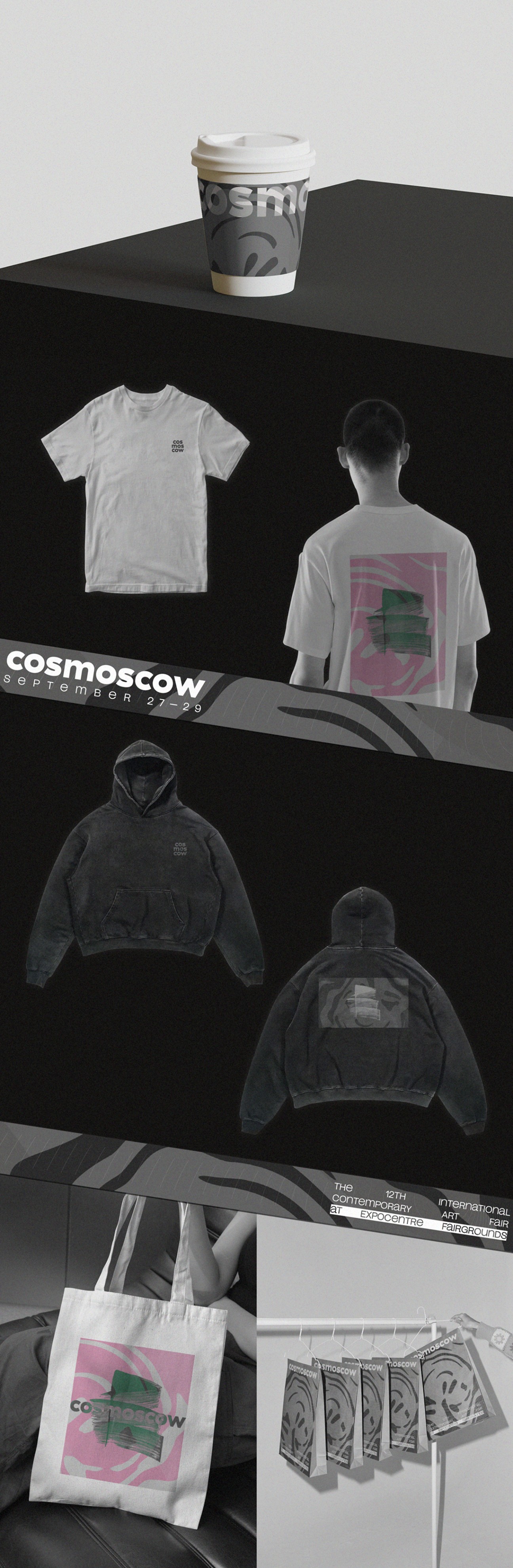
This project was approached with a comprehensive strategy that included creative development across multiple platforms: Social Media, Digital and Print Advertising, and Merchandise Design.
The Cosmoscow International Contemporary Art Fair is an annual landmark event of the Russian fall art season. The main goal of the project is to develop the Russian art market, integrate Russian artists into the international context, and create a platform for interaction between collectors, gallery owners, businessmen, journalists, and the art community.
This project was approached with a comprehensive strategy that included creative development across multiple platforms: Social Media, Digital and Print Advertising, and Merchandise Design.
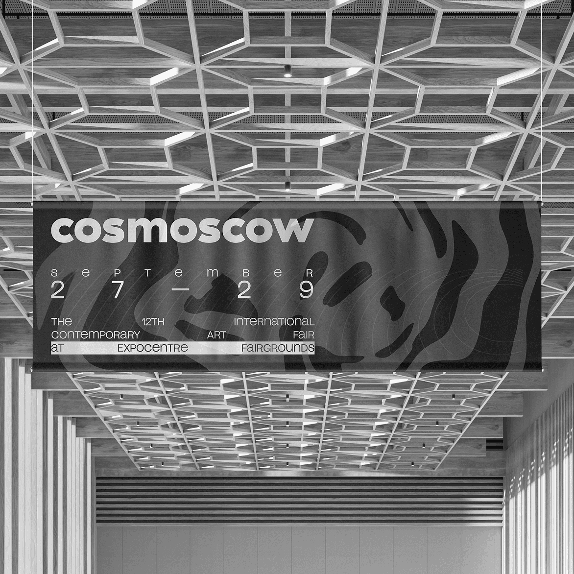
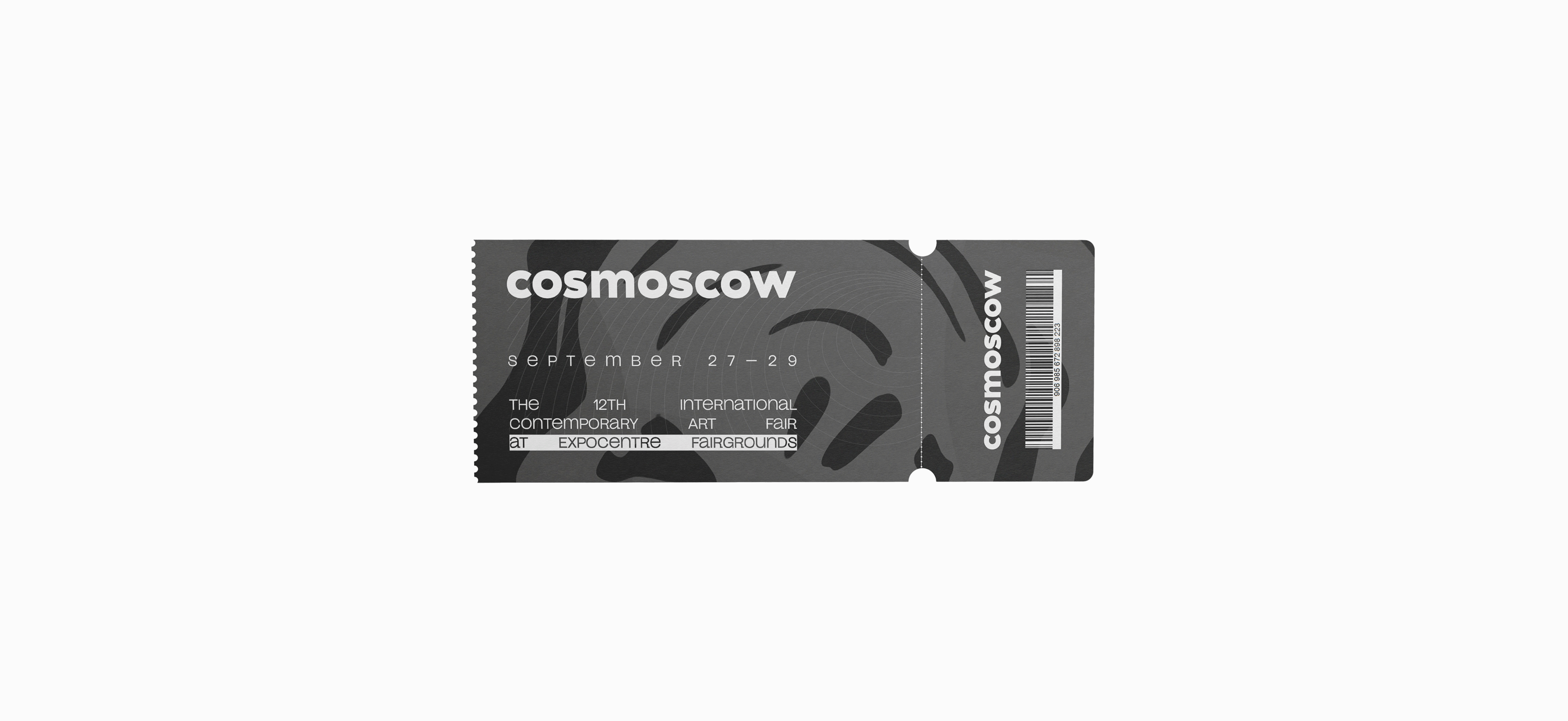
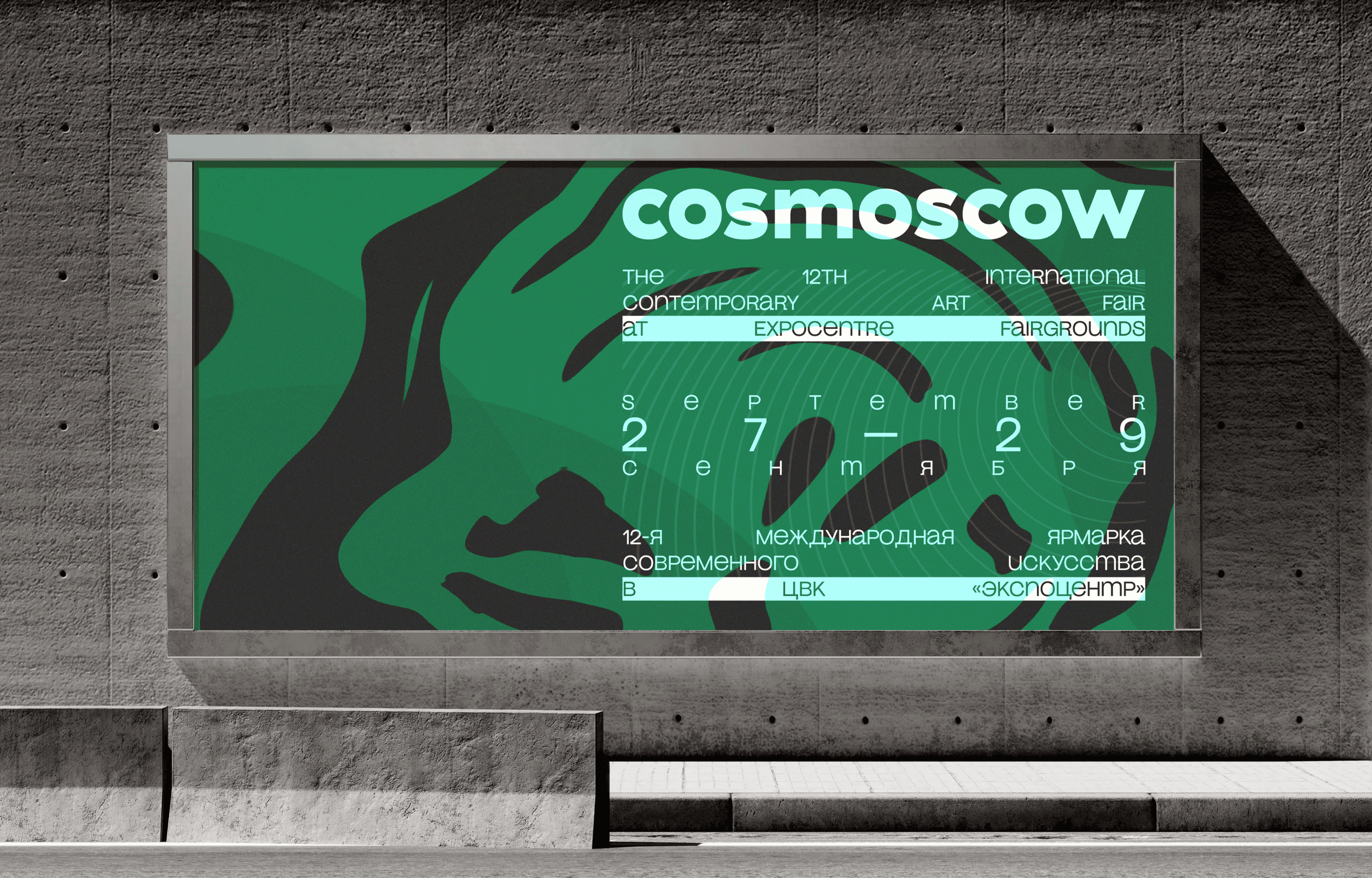
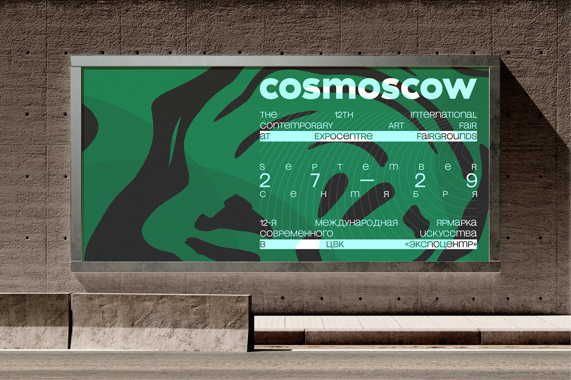
The fair's identity is created based on the works of artists and themes that are important in a given year. This year's theme is Vertigo. For this project, the design concept was centered around reflecting the theme of the year through circular, spherical lines. These lines not only symbolize continuity and connection but also blend seamlessly with a background inspired by the organic patterns of water ripples. This combination creates a dynamic and fluid visual identity.
The fair's identity is created based on the works of artists and themes that are important in a given year. This year's theme is Vertigo. For this project, the design concept was centered around reflecting the theme of the year through circular, spherical lines. These lines not only symbolize continuity and connection but also blend seamlessly with a background inspired by the organic patterns of water ripples. This combination creates a dynamic and fluid visual identity.
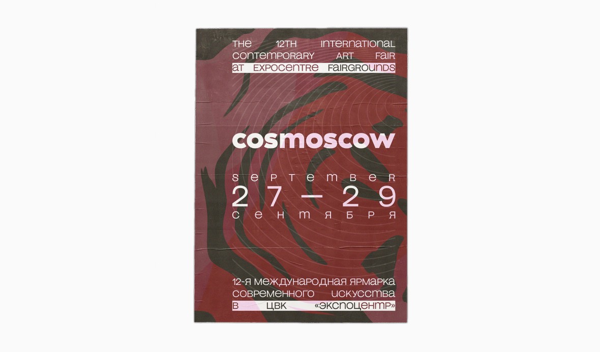
Another unique aspect of this design is its bilingual nature. Given that the exhibition is international, the design integrates both Russian and English languages. This bilingual approach ensures accessibility and inclusivity for a diverse audience, making the content engaging for all visitors.
Another unique aspect of this design is its bilingual nature. Given that the exhibition is international, the design integrates both Russian and English languages. This bilingual approach ensures accessibility and inclusivity for a diverse audience, making the content engaging for all visitors.
In this project, color played a crucial role in distinguishing various advertising materials of the art fair. This approach not only added visual interest but also helped to create a structured and easily navigable environment for the audience. The colors were strategically used for badge designs, making it easy to differentiate between guests, artists, media, and other participants. This color-coding system enhanced organization and helped streamline interactions during the event.
In this project, color played a crucial role in distinguishing various advertising materials of the art fair. This approach not only added visual interest but also helped to create a structured and easily navigable environment for the audience. The colors were strategically used for badge designs, making it easy to differentiate between guests, artists, media, and other participants. This color-coding system enhanced organization and helped streamline interactions during the event.

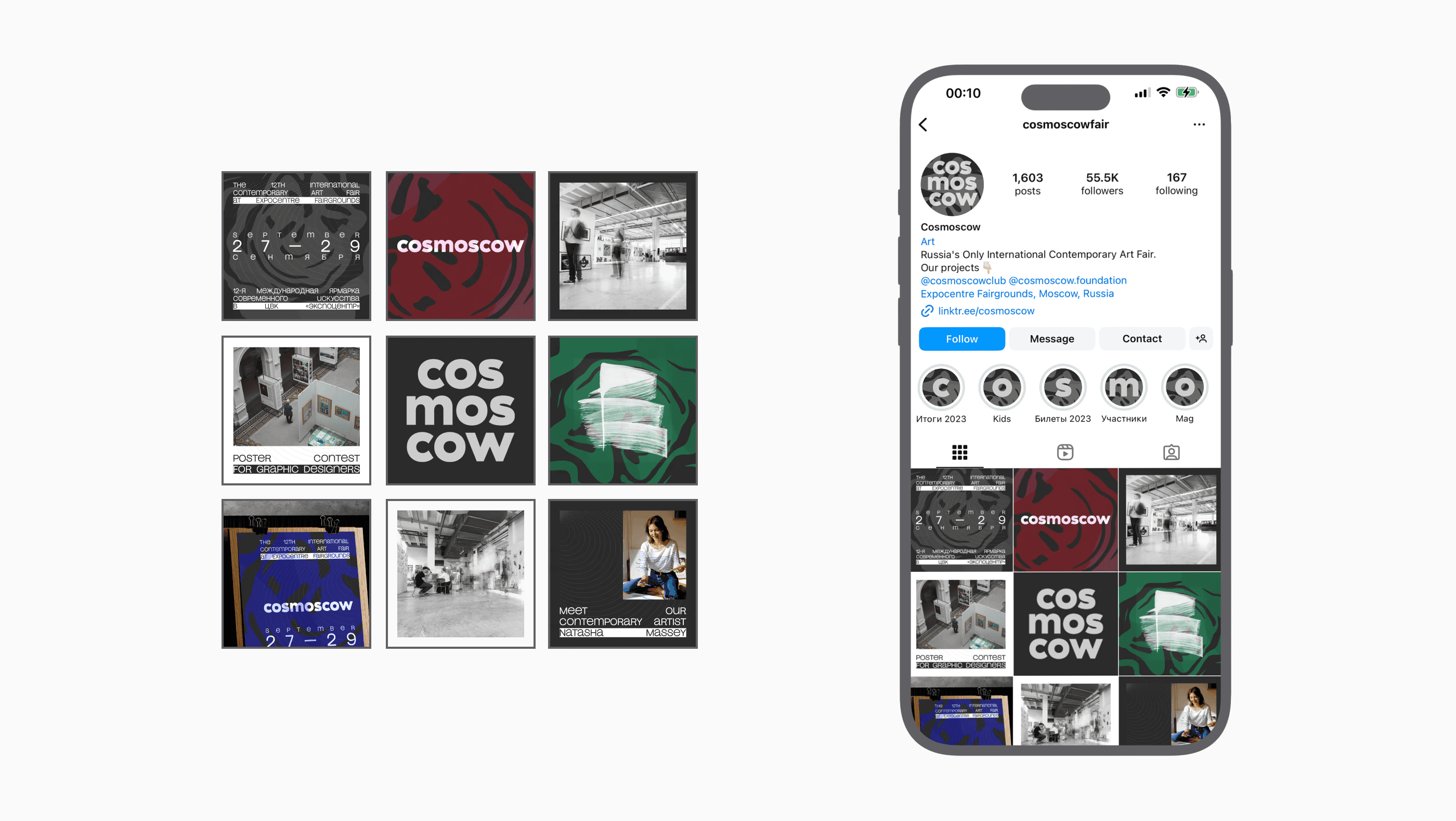
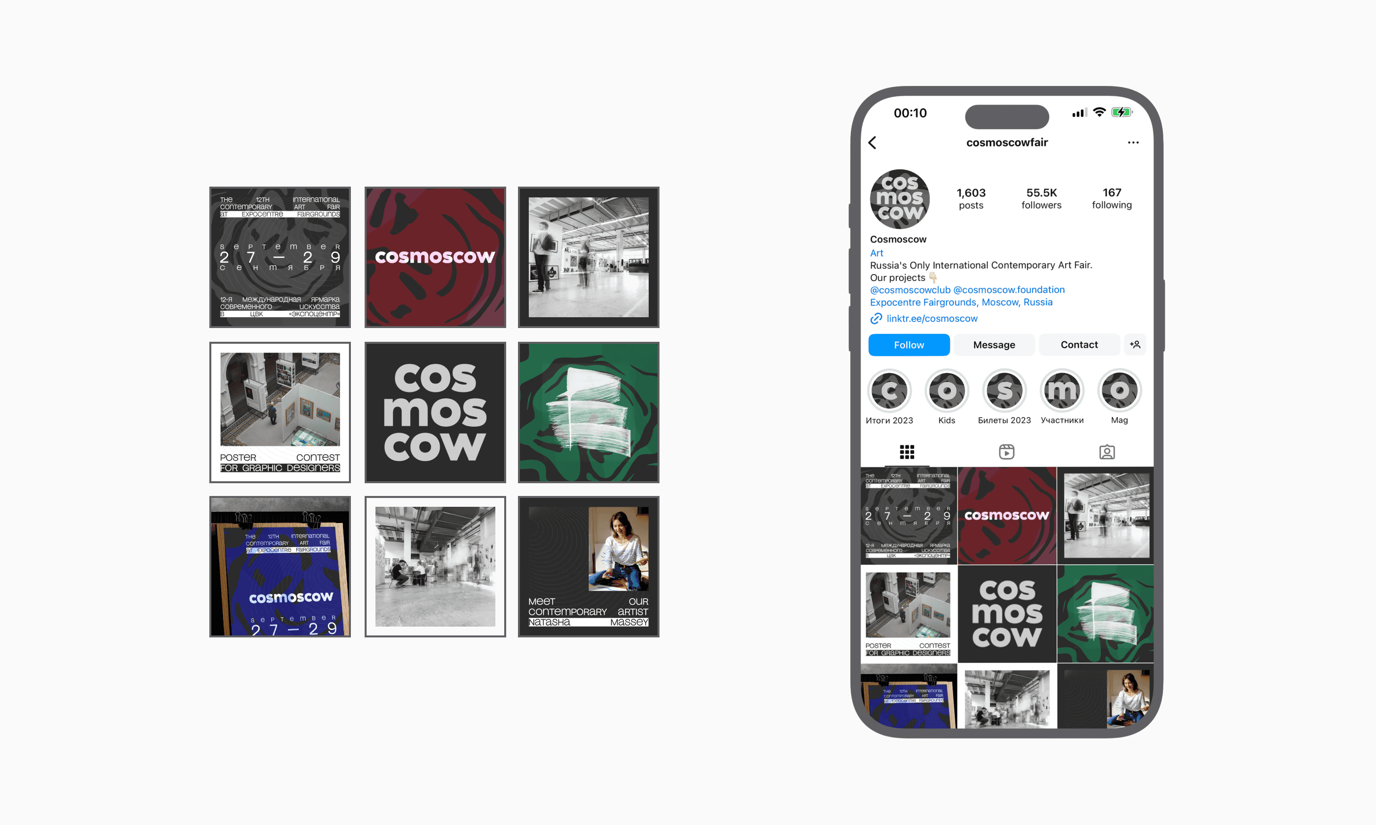
To enhance the visual representation of the art fair, I have developed the social media style for Cosmoscow, including the avatar, highlights, feed, and overall strategy.
To enhance the visual representation of the art fair, I have developed the social media style for Cosmoscow, including the avatar, highlights, feed, and overall strategy.

Visual Identity for Cosmoscow International Art Fair
The Cosmoscow International Contemporary Art Fair is an annual landmark event of the Russian fall art season. The main goal of the project is to develop the Russian art market, integrate Russian artists into the international context, and create a platform for interaction between collectors, gallery owners, businessmen, journalists, and the art community.
This project was approached with a comprehensive strategy that included creative development across multiple platforms: Social Media, Digital and Print Advertising, and Merchandise Design.
The fair's identity is created based on the works of artists and themes that are important in a given year. This year's theme is Vertigo. For this project, the design concept was centered around reflecting the theme of the year through circular, spherical lines. These lines not only symbolize continuity and connection but also blend seamlessly with a background inspired by the organic patterns of water ripples. This combination creates a dynamic and fluid visual identity.
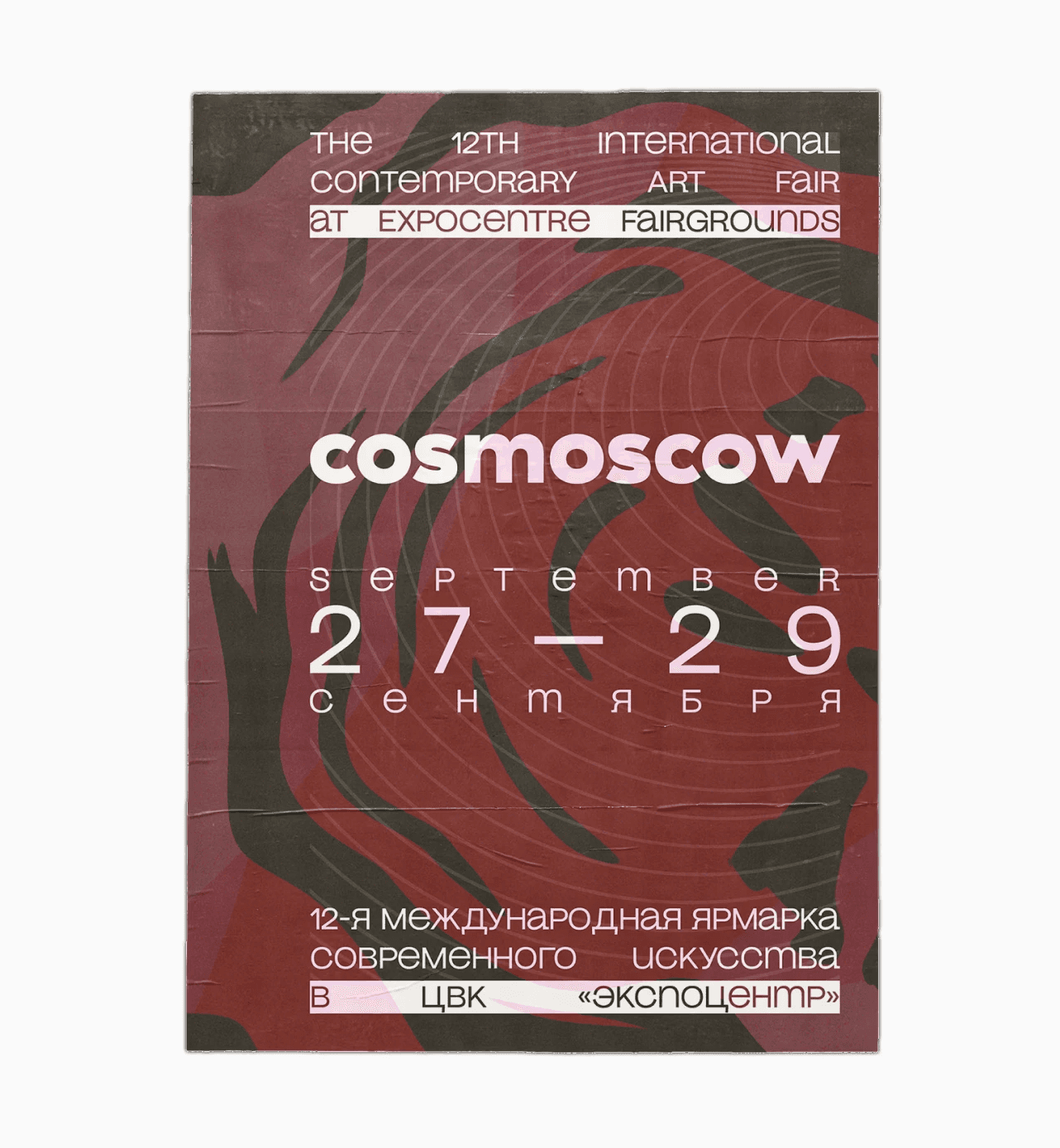
Another unique aspect of this design is its bilingual nature. Given that the exhibition is international, the design integrates both Russian and English languages. This bilingual approach ensures accessibility and inclusivity for a diverse audience, making the content engaging for all visitors.
In this project, color played a crucial role in distinguishing various advertising materials of the art fair. This approach not only added visual interest but also helped to create a structured and easily navigable environment for the audience. The colors were strategically used for badge designs, making it easy to differentiate between guests, artists, media, and other participants. This color-coding system enhanced organization and helped streamline interactions during the event.
To enhance the visual representation of the art fair, I have developed the social media style for Cosmoscow, including the avatar, highlights, feed, and overall strategy.